Reading rates on WeChat Official Accounts can be extremely low: 10% for service accounts on average, and at best a few percents on Subscription Accounts.
There’s one way to increase these numbers: enticing cover pictures. Today we share 3 tricks to increase your reading rates with creative banner pictures.
-
The 3D effect
What does it look like?
If you are seeing this article on our blog or because friends shared it with you, then good for us, but you’re missing out!
If you were lucky enough to be one of our WeChat followers, here’s what you would have seen:
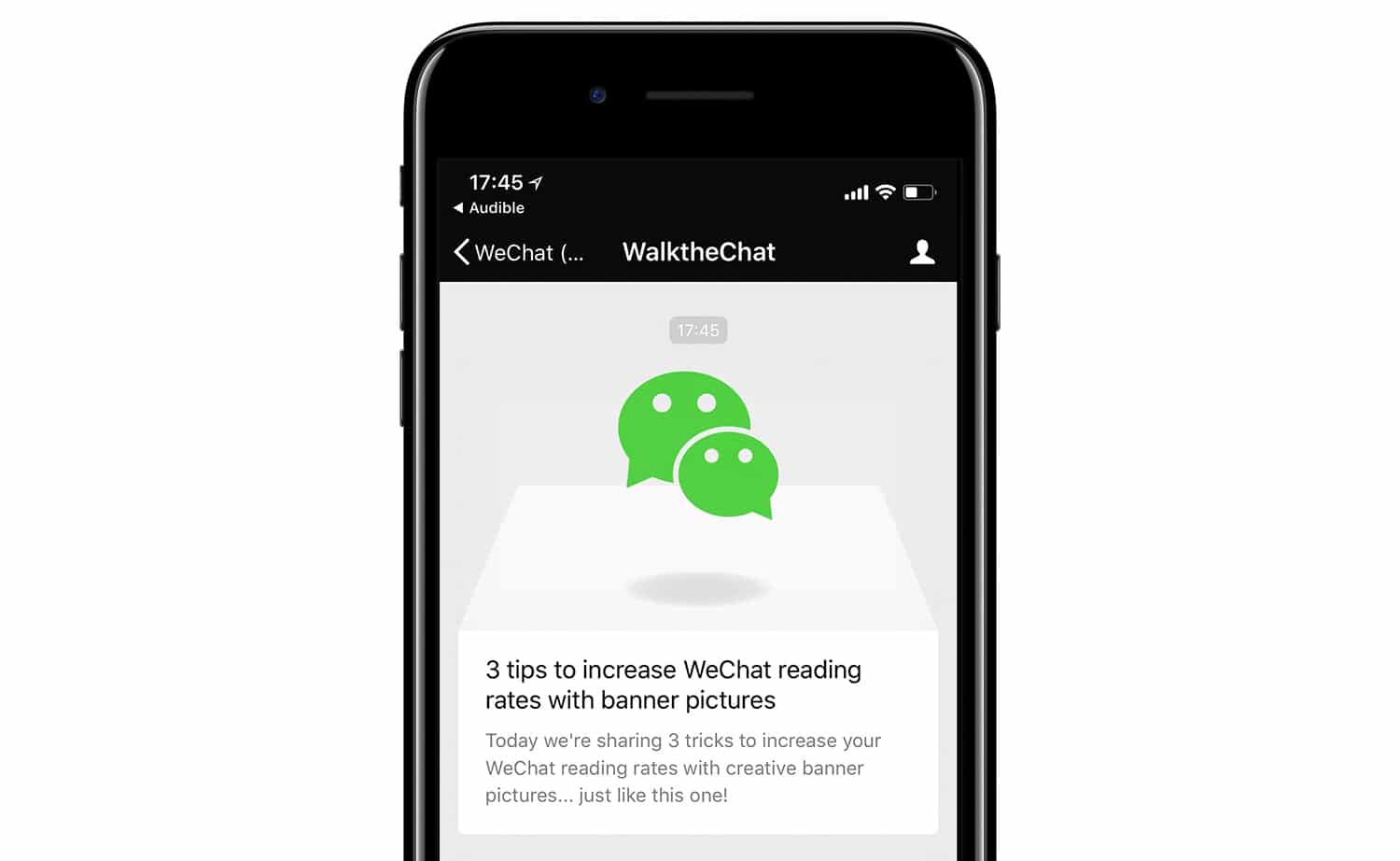
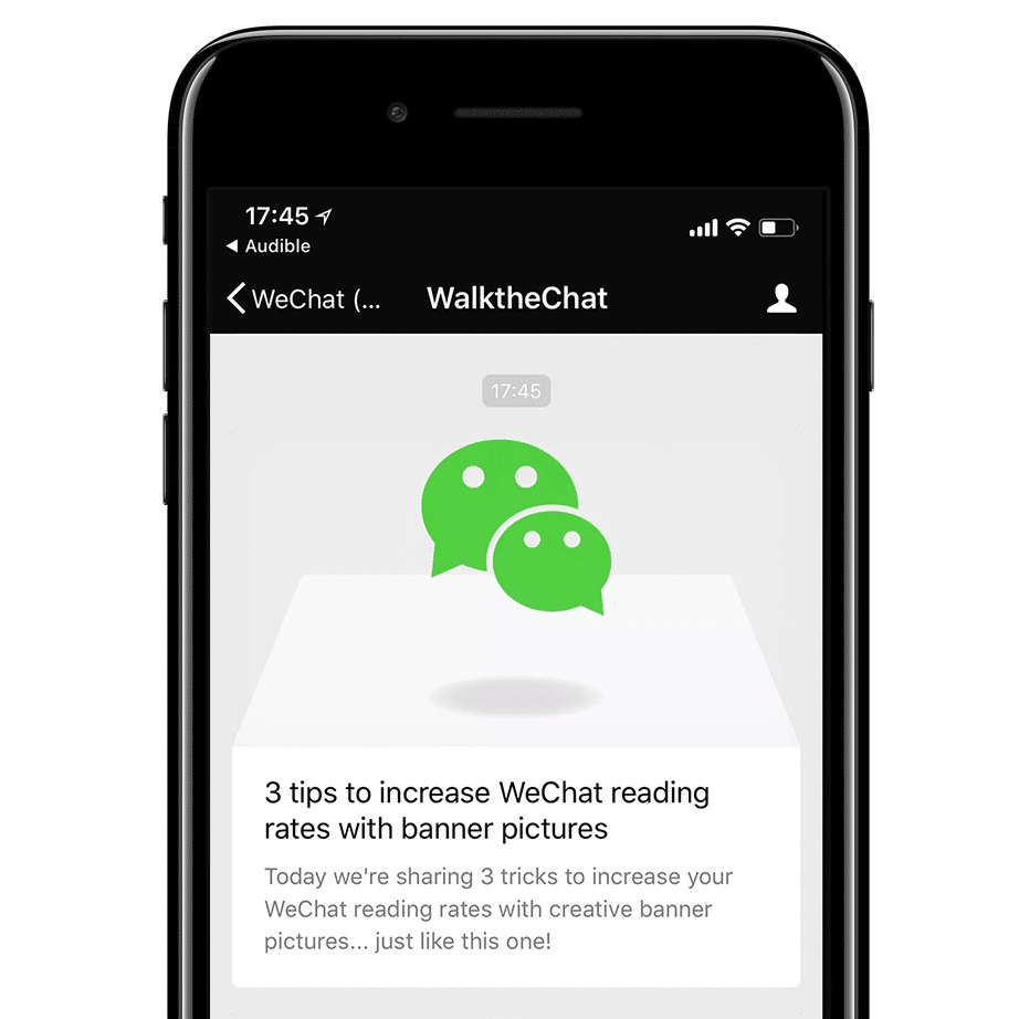
See this cool 3D effect? It is definitely eye-catching and stands out from the crowd of WeChat Official Accounts.
Who else is using it?
We haven’t invented this effect. Other large WeChat accounts have been using it.
For instance, the accounts “会火”, “haruru”, “深夜发媸” and “YangFanJame” made good use of the feature, creating fun and engaging banner pictures:
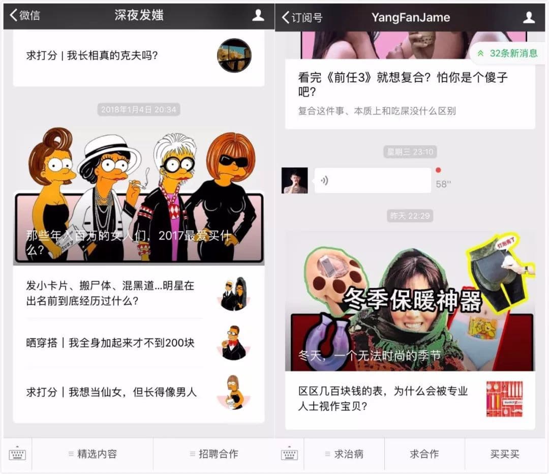
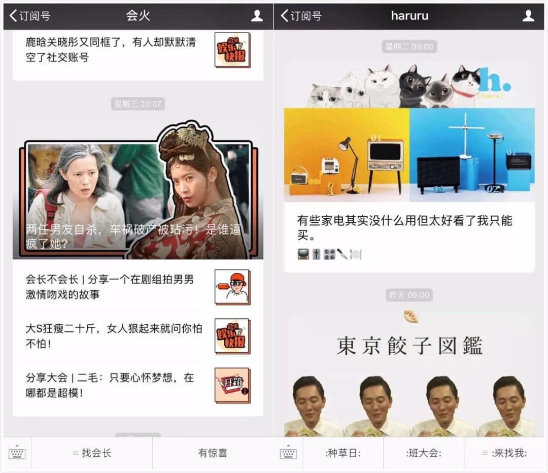
Photo credit: newrank.cn
How to make it on your own account?
If you’re into design, you might already have picked up the trick.
This effect is brand new because a few weeks ago the design of WeChat Official Accounts messages changed. There used to be a white border and date around the picture. This border was recently removed:
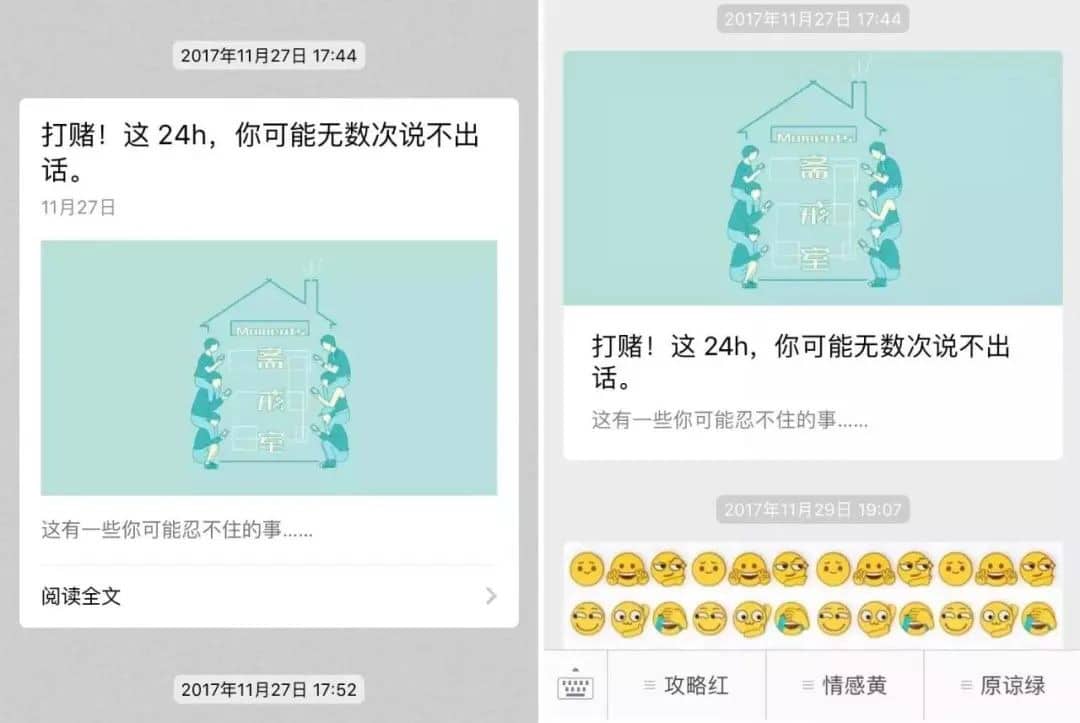
Photo credit: newrank.cn
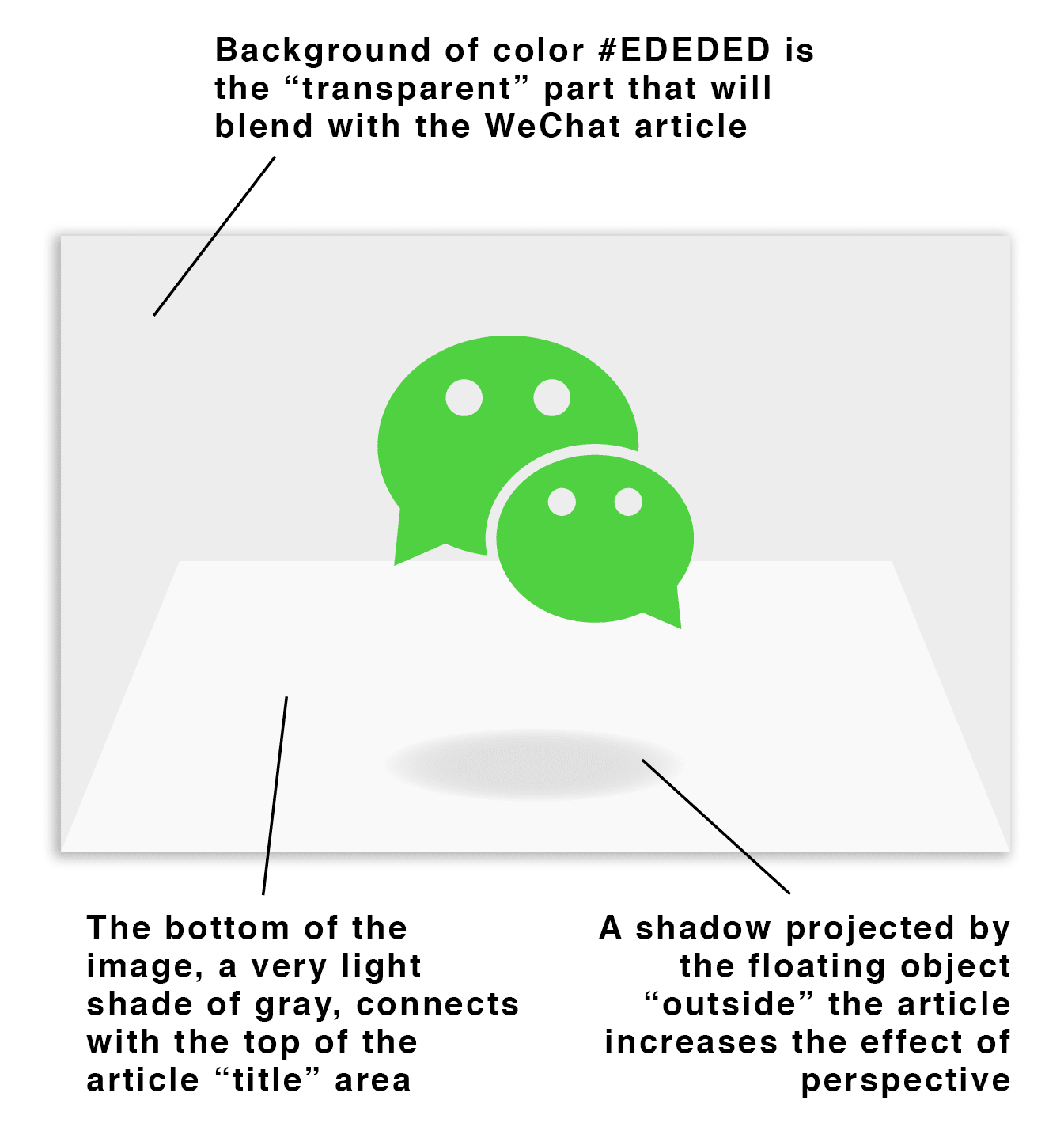
Now that the border is gone, it’s possible to blend the top and side of your article with the background, creating cool 3D overlap effects. All you have to do is using elements on the side and top that are the same color as the background.
Good to know: the hex color of the WeChat background is #EDEDED
Here’s a breakdown of the cover picture of this article:
-
The branded border
Not all of WeChat Official Accounts disliked having a border around their picture. Removing the WeChat default border gave them an opportunity to design their own.
Many accounts took the opportunity and designed branded borders around the pictures that reflected their brand positioning:
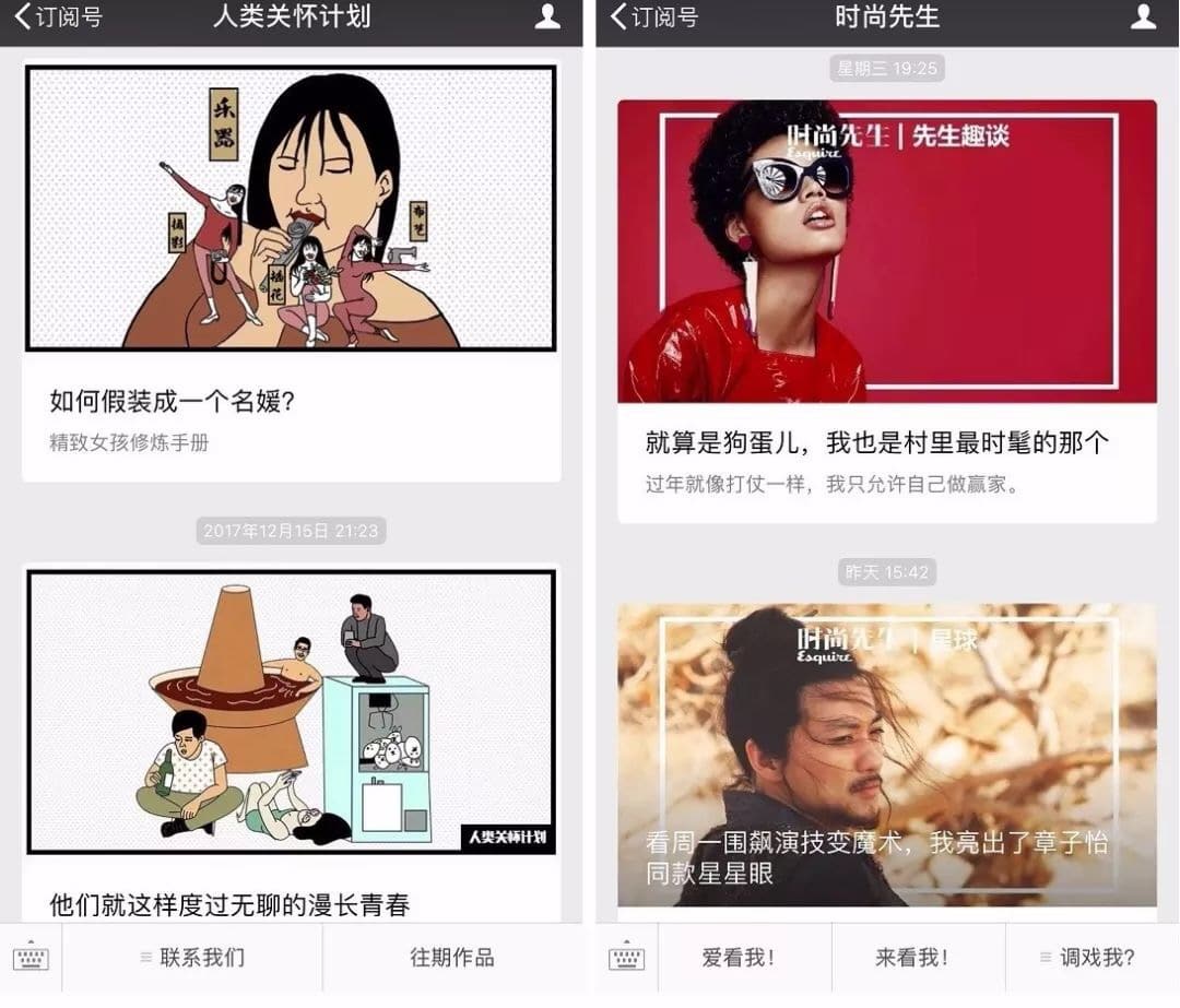
Photo credit: newrank.cn
The account gogoboi uses a colored background for each picture, which changes for each article. This interesting design choice creates a mix of variety and consistency:
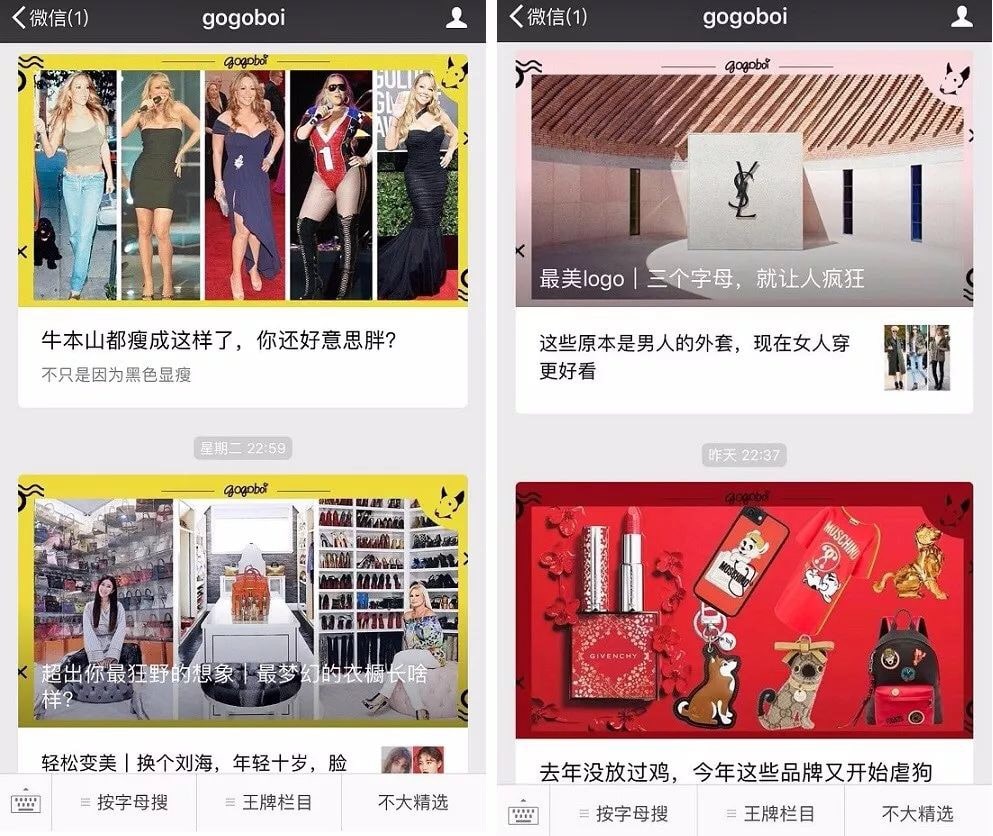
Photo credit: newrank.cn
The account 网易王三三 chose a two-layered structure, using a blurred version of the cover picture as a background for a branded card.
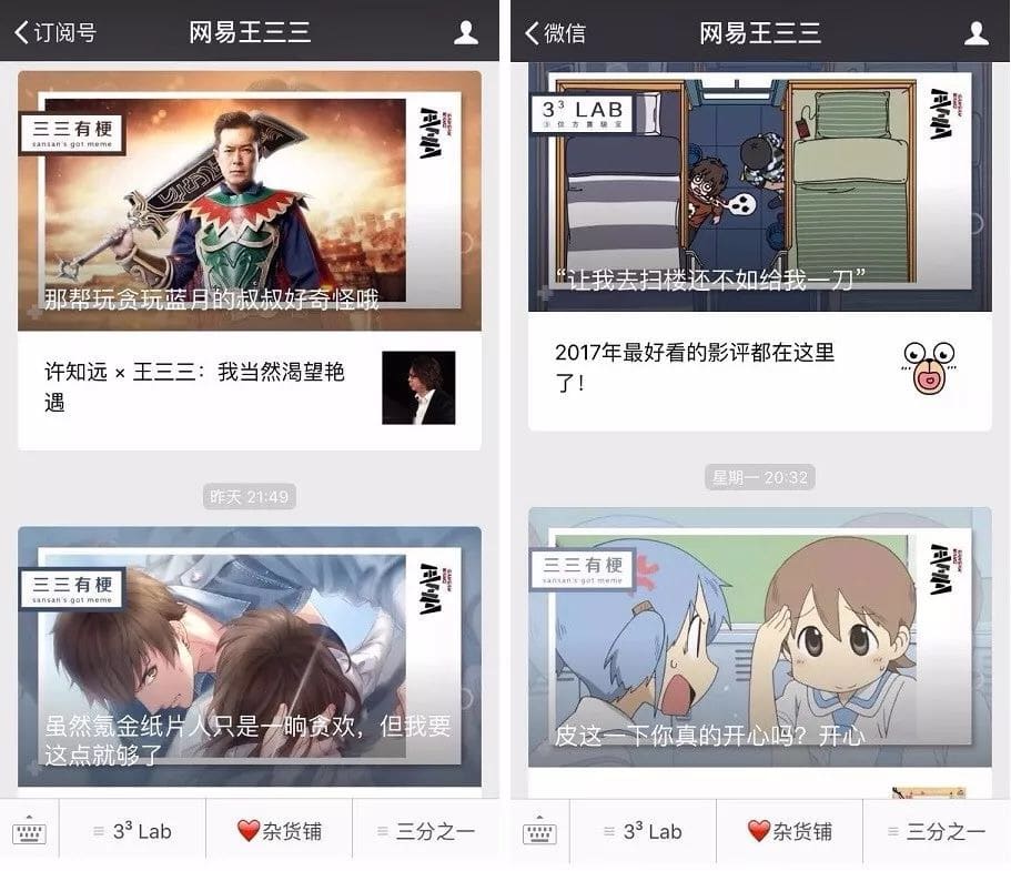
Photo credit: newrank.cn
-
The magazine cover
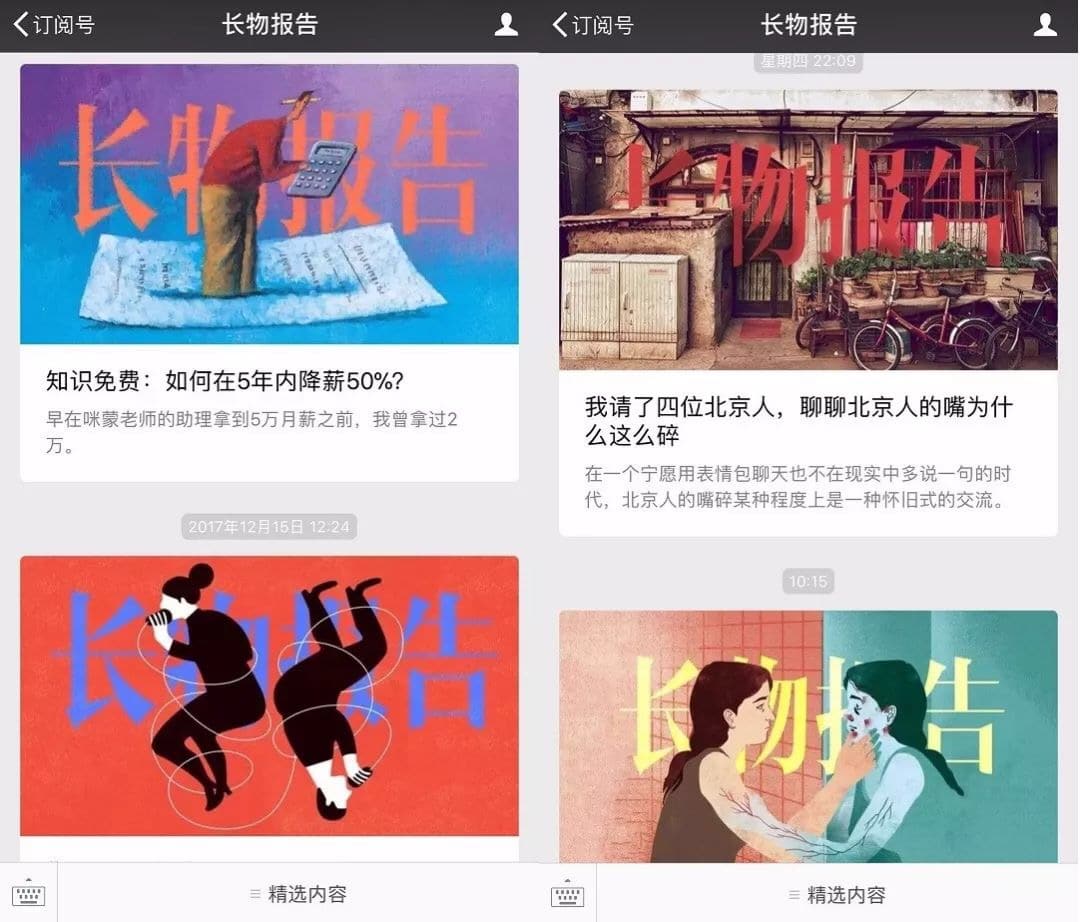
Another popular choice is a “branded” cover picture, featuring the name of the account and reminiscent of a magazine cover. This is for instance the approach picked by the account “长物报告”.
Photo credit: newrank.cn
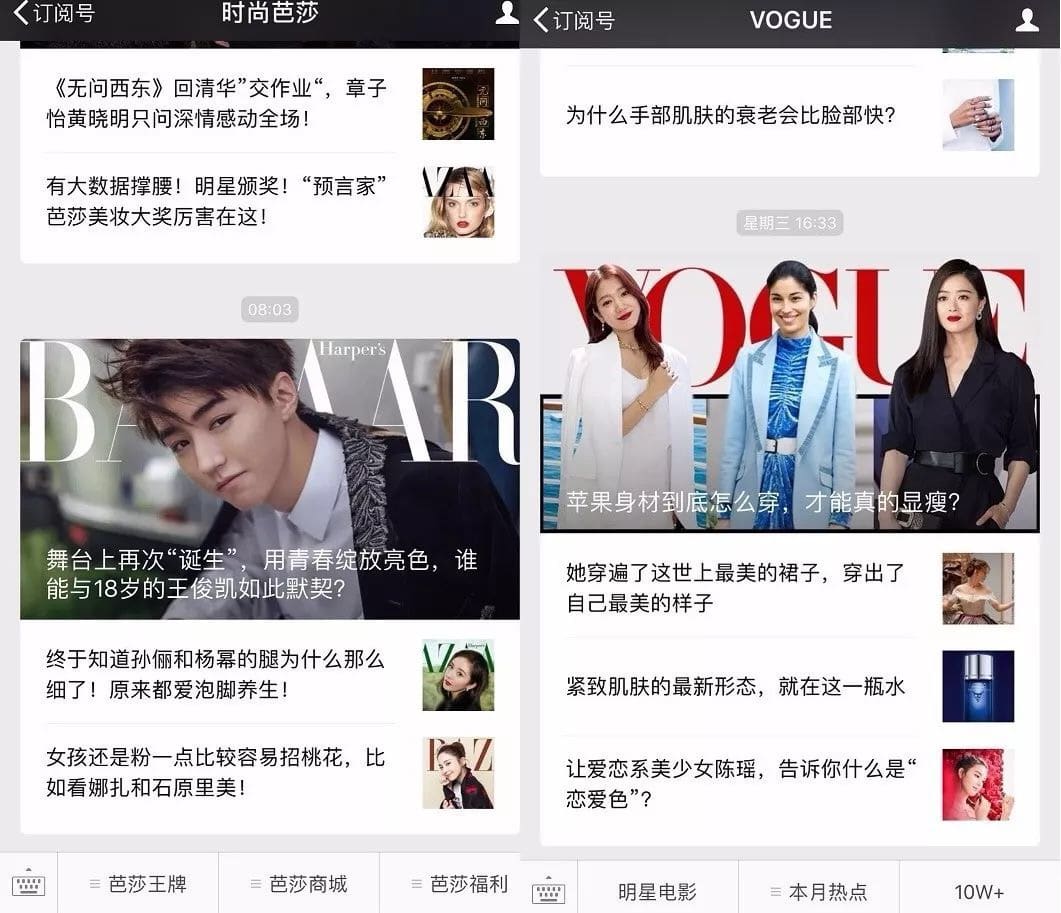
Of course, many magazines such as Bazaar and Vogue also took this branded approach.
Photo credit: newrank.cn
Conclusion
No matter the model you pick, cover pictures are a great opportunity to showcase both your creativity and brand image.
Continuous innovation combined with consistent branding will enable to increase your reading rates (as readers will be intrigued to see what you come up with next). It will also make your content thumbnail more recognizable (further increasing reading rates) once shared on moments and other channels.
Note: this article was heavily inspired by this article (in Chinese) from Newrank. Credit to them for coming up with these insights!

